We create stages where performers and audiences meet through music
Seoul Music Management is a concert production company that values the artistic worth of music and creates experiences in which people are moved and connected through it
We produce concerts and festivals with world-class musicians, and support the next generation of musicians through masterclasses and our academy
Through the Great Artists Series we record outstanding performances on high-quality film, sharing them with audiences around the world and preserving them as an artistic record for the future
We believe that sincere music speaks deeply to people and stays with them for a long time
In the concert hall, performers and audiences share the experience of live music in one space; online, the official Seoul Music Management YouTube channel brings great music into everyday life, anytime and anywhere
Seoul Music Management will keep connecting people through music and creating special experiences of shared emotion and communication
We produce classical concerts of the highest standard with world-class musicians, and create special stages where musicians and audiences meet up close
An international classical music festival with leading Korean and international musicians — a place for outstanding performances and artistic exchange
We support young musicians through masterclasses and our academy, and record outstanding performances in the Great Artists Series and other films to share them with more people
Great Artists Series — first series releasedMathieu Dufour & Shunji HirotaSeoul Music Management YouTube Channel ↗
Great Artists Series — second series releasedHenrik Wiese & Junhee KimSeoul Music Management YouTube Channel ↗
Visible Music, Audible Tiles
How the Seoul Music Management symbol was made
Text · photos
Sunghwan Jang, 203 Design
A first meeting, and a sense of excitement
Our first meeting was on 3 September 2025, to discuss the promotional design for the 2nd Seoul Winter Music Festival. Talking with CEO Soyoun Kim, I could feel her deep passion for music. Afterwards, looking through the programme book and business cards from the first festival, all sorts of ideas came to mind
A certain excitement. I was told that in the classical concert world, design for promotional material is still not given much attention, and because audiences are so centred on loyal fans, keeping promotion to a minimum is the norm
Even so, I wanted to do more. The previous symbol — purple, with the tiled roof of a hanok — had been commissioned from an image the CEO had in mind. It did not seem able to stand for “international”, “Korea”, “Seoul” or “music”
The festival was still young, so I argued that now was the time for a bold change — it needed an identity worthy of an international music festival with artists from abroad. Fortunately, Ms Kim welcomed the idea
Surprisingly, the design process was quick and smooth. Brand design can sometimes drag on for a long time, but sometimes the answer arrives like a flash of lightning
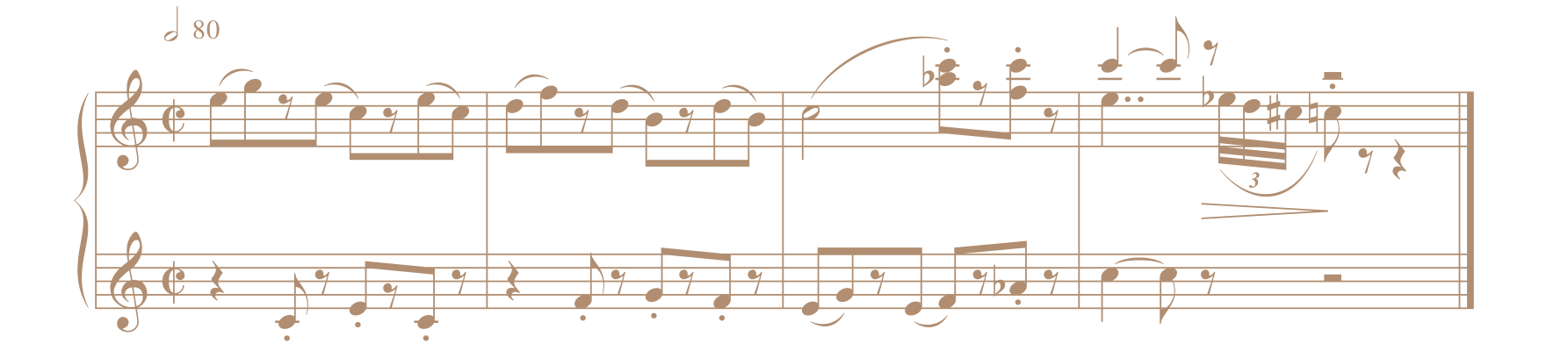
'Seoul Ragtime'
The key question was how to keep the tiled roof — the traditional Korean motif of the old symbol — while giving it a musical quality. With Ms Kim’s help, it came together very easily
The longer I looked, the more the vertical grooves of the roof looked like musical notes. What if we could put music into those tiles? But there were dozens of grooves — far too many. So I asked Ms Kim whether a short piece of logo music, about one bar long, could be written
She immediately asked Henrik Wiese — a festival artist and a friend she greatly respects — to compose it. After a few revisions, the melody “Seoul Ragtime” was born
In search of a graceful, dignified line
The roofline of the old symbol resembled an ordinary hanok or the roof of Gwanghwamun — it was too familiar, and we needed something distinctly our own. Then I thought of Jongmyo, the royal shrine of the Joseon kings and queens, where the traditional ritual music Jongmyo Jeryeak is still performed. Its roofline looked more graceful and dignified
I then combined the new roofline with the notes of the first bar of Henrik Wiese’s melody. The still roof tiles came alive, as if you could actually hear the music
Then came the fine-tuning, like tuning a piano. The note stems were made thicker than in the score so the symbol would still read clearly at its smallest size, on a business card. The symbol is rose gold on dark green — the colour of old traditional roof tiles. Ms Kim answered the proposal with delight
Henrik Wiese, who has synaesthesia, says that to him Seoul is white, silver and green, and feels like C major. Happily, we already had dark green, rose gold and winter white in mind as the main brand colours. This, I thought, is how history happens
Ms Kim’s open-mindedness, Henrik Wiese’s brilliant composition and the visual language of design came together in a symbol worthy of Seoul Music Management and of an international event, the Seoul Winter Music Festival. My thanks also to Myunghee Kim of Cooldiga, who made this project possible, and to the 203 staff who worked on it
